Carry On

Overview
The quote about travel has been true since the 4th century. For such an invaluable experience, traveling is notorious for being nerve-wracking and stressful. Life is short and sweet, so now is the time to explore.
Our app, Carry-On, is an AI-generated companion to bring out the adventurer in all of us, simplifying the process of traveling, so that we can expend our energy on explorations and experiences.
In this team, my role was to provide UX Design and Design Strategy, in addition to facilitating usability testing.
UX Design/Design Strategy
Empathy Maps
Extreme Users
Interviews
Workflows
Prototype
Branding
Visual Design
Accessibility/Inclusive Design
UX Research
User Interviews
Competitive Analysis
UX Writer
Clear navigational way-finding
Labels match and are consistent
Watch out for visual, intellect, memory, and motor load
Usability Testing
Develop a script with the team
Conduct pilot testing
Create screen test
Create prototype
Design Challenge
As the demand for travel increases, planning travel has become a significant roadblock. In today's fast-paced world, where balancing work, family, and personal life is a constant challenge, I sought to solve a few challenges when planning travel:
Reduce our target users’ decision fatigue when planning travel
Minimize the amount of time it takes to plan a trip
Provide an exploratory trip feature to view alternative trip locations
Decrease FOMO (Fear of Missing Out) around travel planning
I wanted to build an all-inclusive travel app that simplifies the travel-planning process and solves pain points for our users.
That’s where Carry On comes in.
research
User research informed all of the design decisions for the Carry On app. At the start of the project, I performed various user research activities with Carry On stakeholders. First, we searched for data to better understand our user’s motivations around planning travel. This is what we found:
More than 92% of Americans say travel is nerve-racking
23% experience most stress during planning and preparation
66% of individuals say that the biggest stressor with trip planning is when you're putting together an itinerary.

Based on this data, we utilized Design Inspections, Lean Canvas, Empathy Mapping, Affinity Mapping, and User Interviews to determine our design methodologies.
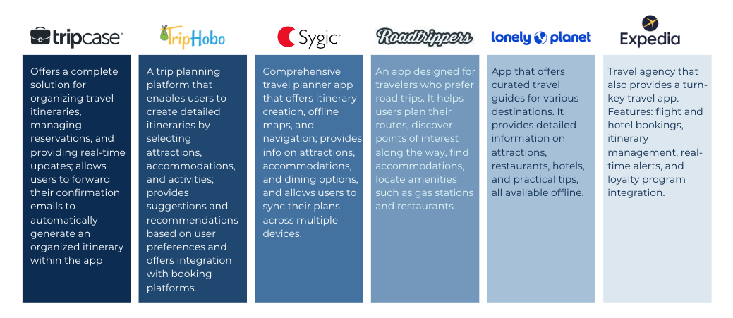
Design Inspection
We analyzed our competitors to determine what features were successful on their apps and how we could build on that to improve the user experience. These were just a few of our findings below.
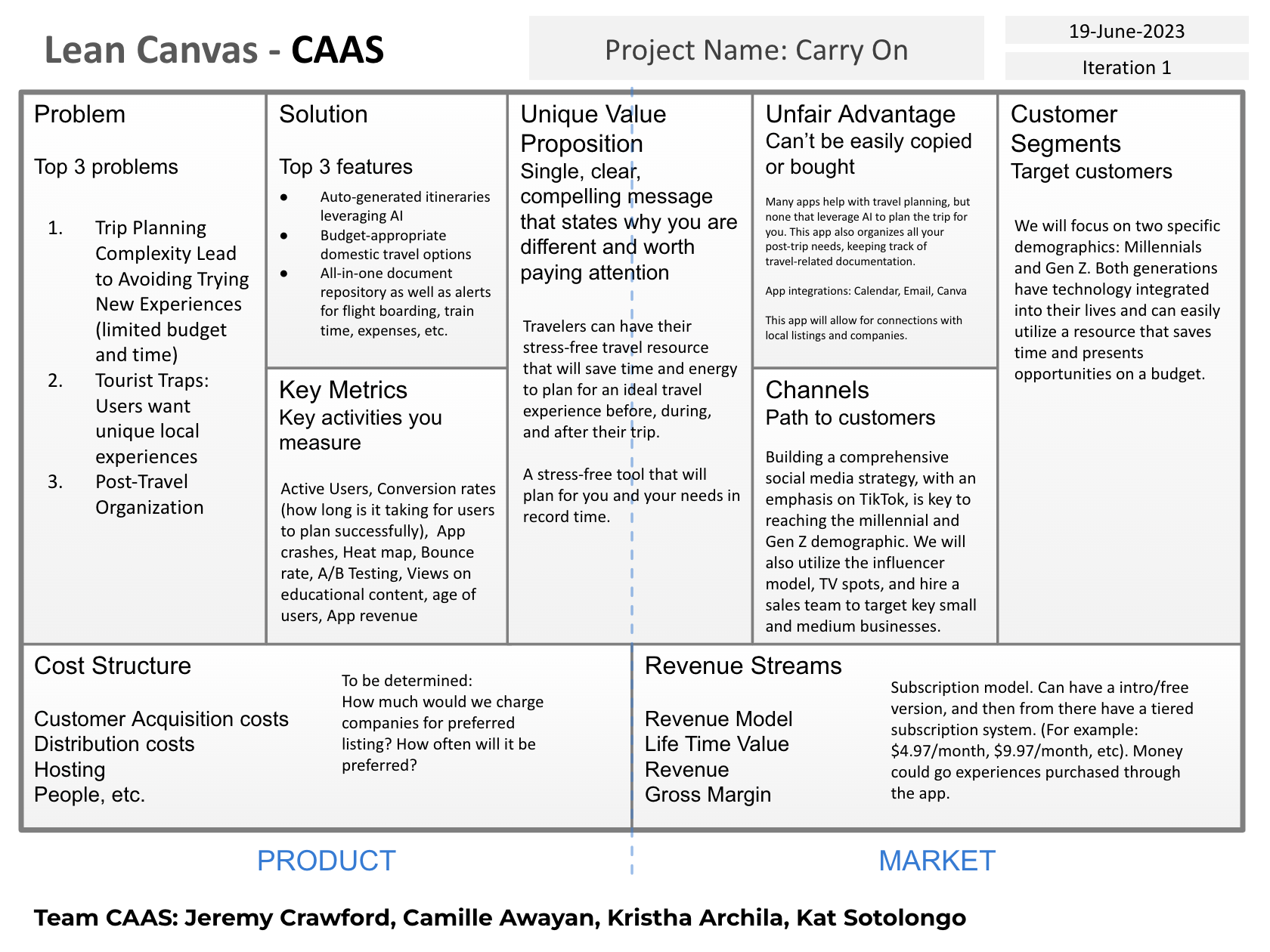
Lean Canvas
At the start of the project, I assembled the stakeholders to quickly fill out the lean canvas to look at the many different perspectives around travel planning. The Lean Canvas provides initial alignment for the Carry On app, which the stakeholders and I refined and reviewed throughout the project.
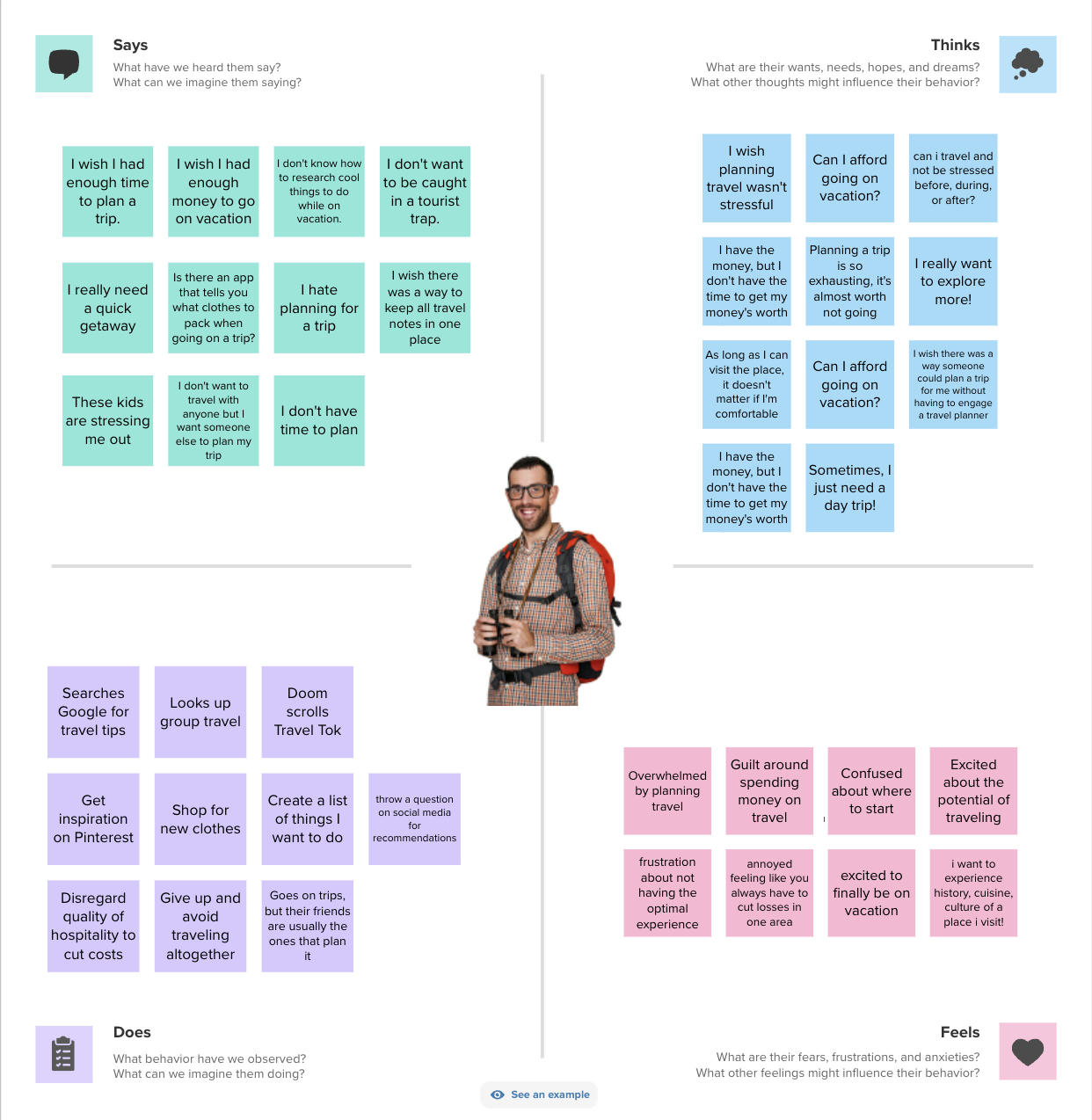
Empathy Map
I built an Empathy Map with the Carry On stakeholders as a first step in understanding the primary user I would be interviewing.
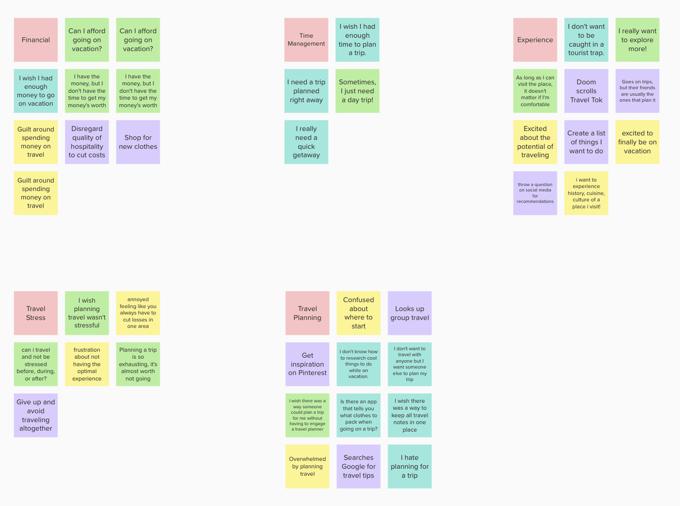
Affinity Maps
From there, we clustered common themes shown using an Affinity Map and came out with five key findings.
Our users want to make sure they can afford the trip of their dreams
Travelers want to maximize their trip and have an app time manage their vacation
In general, our users don’t want to be caught in tourist traps. They want to find unique experiences.
Our users want to reduce travel stress when planning
Our users are overwhelmed by travel planning and could use support
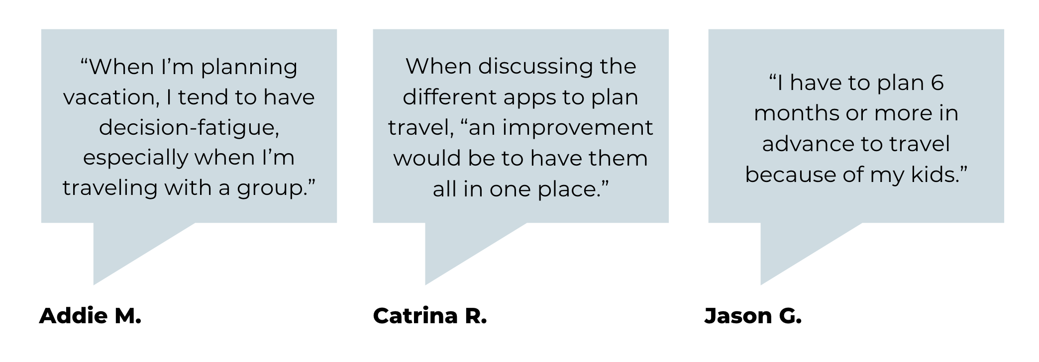
User Interviews
After getting initial alignment during the empathy map phase, my team and I interviewed 7 users, and I led two of those interviews. I wrote a discussion guide and discovered a few key findings:
Design
After completing the research, I started the design phase of the project, which included the following activities.
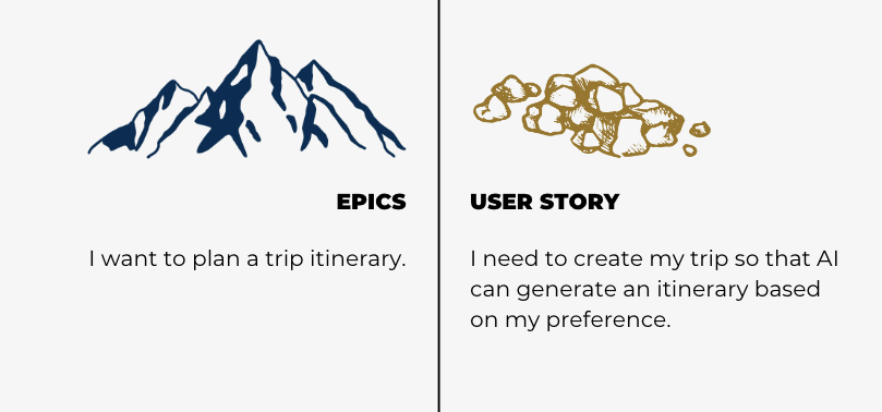
Epics and User Stories
After completing the research, I wrote epics and user stories to shape the direction of the product and helped to identify what the user's needs were.

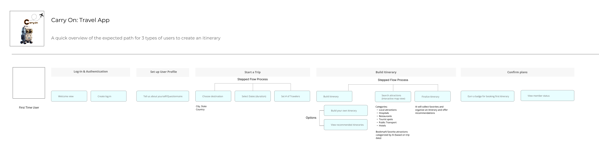
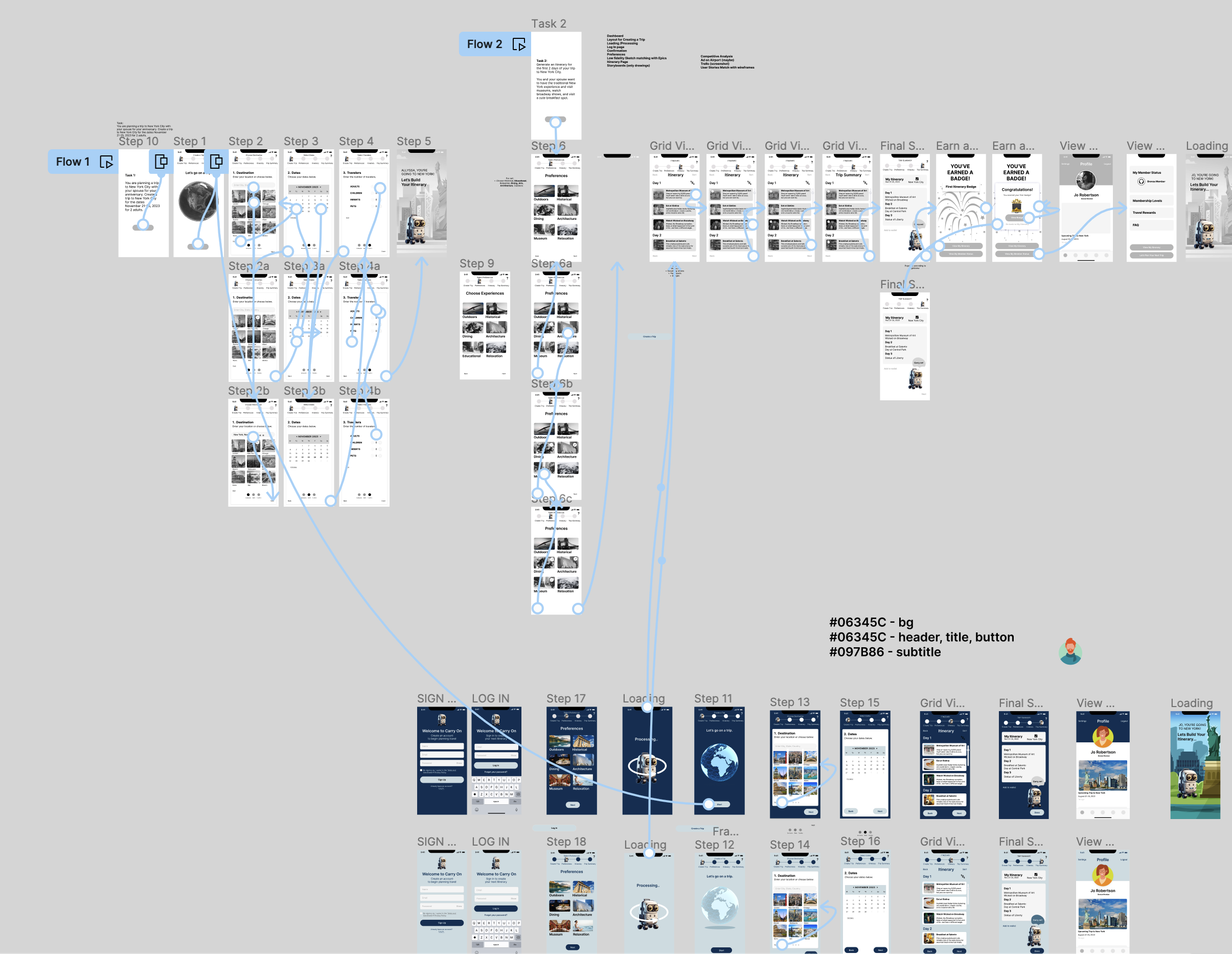
User Workflow
To begin designing, I created a user flow for a first time user of Carry On. User workflows provide how an app feels as a person moves from page to page. As the UX Designer on this project, I start with a user workflow with the stakeholders to:
Explore possibilities and processes without going into visual design.
Optimize the workflow, identify gaps, and find new opportunities.
Determine the user interface based upon the final workflow.
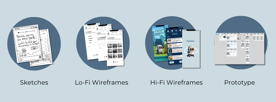
UX Sketching
With the workflows optimized, I created the initial sketches for the product screens. All of the product screens were refined, reviewed, and revised with the product stakeholders.

Low-Fidelity Wireframes and High-Fidelity Wireframes
After completing the UX sketches, I created low fidelity wireframes. As a UX Designer, I used low fidelity wireframes to quickly collaborate with my stakeholders to get alignment and feedback.
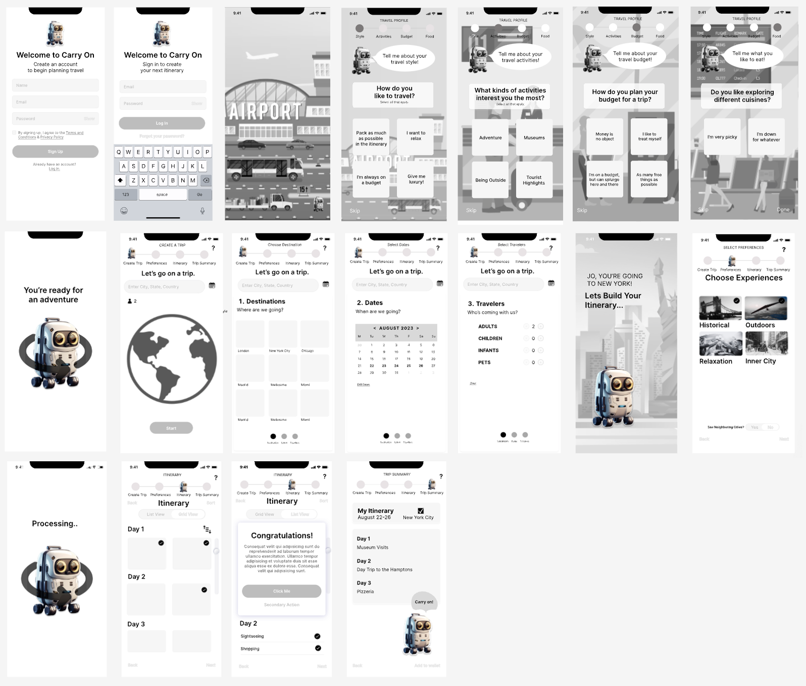
Here are some samples of our high-fidelity wireframes.


Style Guide
I worked with the stakeholders to create the style guide. The Carry On app has a clean look and feel, utilizing the sans-serif typeface Montserrat and cool tones for colors.

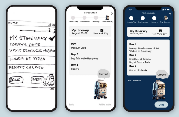
Storyboard
By storyboarding the user story, we’re able to visually communicate their experience to stakeholders.

Prototyping
After designing the experience, I created an interactive prototype using Figma to visualize the experience for users and stakeholders. You can find a link to the interactive prototype here.
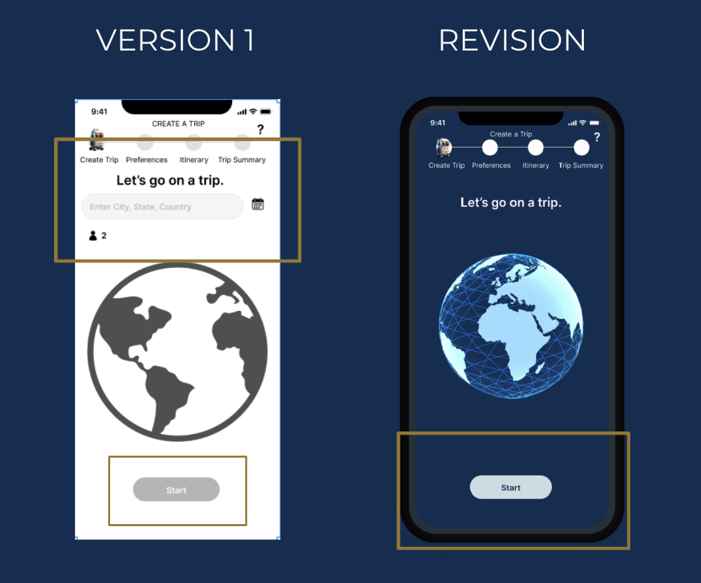
Usability Testing
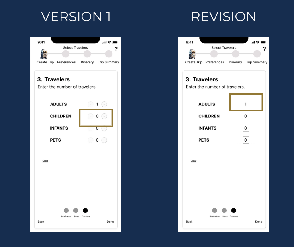
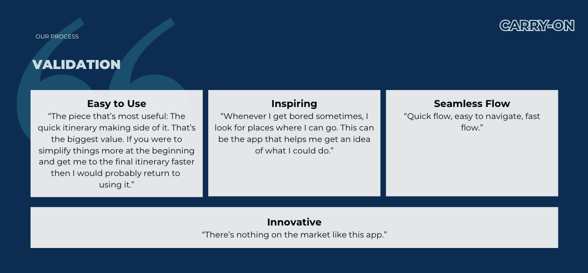
After creating a clickable prototype, I validated the product design with several users and made changes to the product design. We conducted 4 usability interviews and tests, and came out with 2 user insights.

Insight 1: Simplify
Users had trouble figuring out where to click and start. Our takeaway: Every icon, button, and image should serve a purpose; otherwise, they may be distracting.
Insight 2: Easy Access
Secondly, we found that it was important to ensure easy access. While pressing a radio dial twice might be simple, it becomes cumbersome with 10 travelers. Users recommended adding a field for entering dates and the number of travelers.